
Project Overview
A mobile course evaluation app designed to help students feel heard, more engaged, and find meaning in the process.
Challenge: Create a non-monetary incentivized course evaluation app for ClassRanked.
Roles: UX Researcher, UI Designer, Interaction Designer
Timeline: 2 Week Sprint (2022)
Client: ClassRanked
1. User & Stakeholder Interviews
Pains:
71% of students felt they were not being heard when taking evaluations as they had no idea where the information went or who had access to this information.
57% of students were upset that they were not given access to survey results to compare how they felt with the majority of the class and have their opinions validated.
86% of students did not feel connected or engaged during these evaluations and found them meaningless as they receive no benefits.
Goals:
To see their influence in creating an improvement,
To feel engaged.
To feel like these evaluations benefit them as well.
ClassRanked's goal was clear from the stakeholder interview: build a non-monetary incentivized course evaluation app that actually gets students to engage. With no existing data on student experiences, I ran 7 one-on-one interviews across 2 university campuses and synthesized findings into an affinity map to identify patterns.
Demographics:
Participants between the ages of 18–22.
Majority of participants: Caucasian, Hispanic, Male, Reside in Miami.
Participants spend an average of 10–15 minutes on course evaluation surveys.
43% students avoided taking course evaluations.
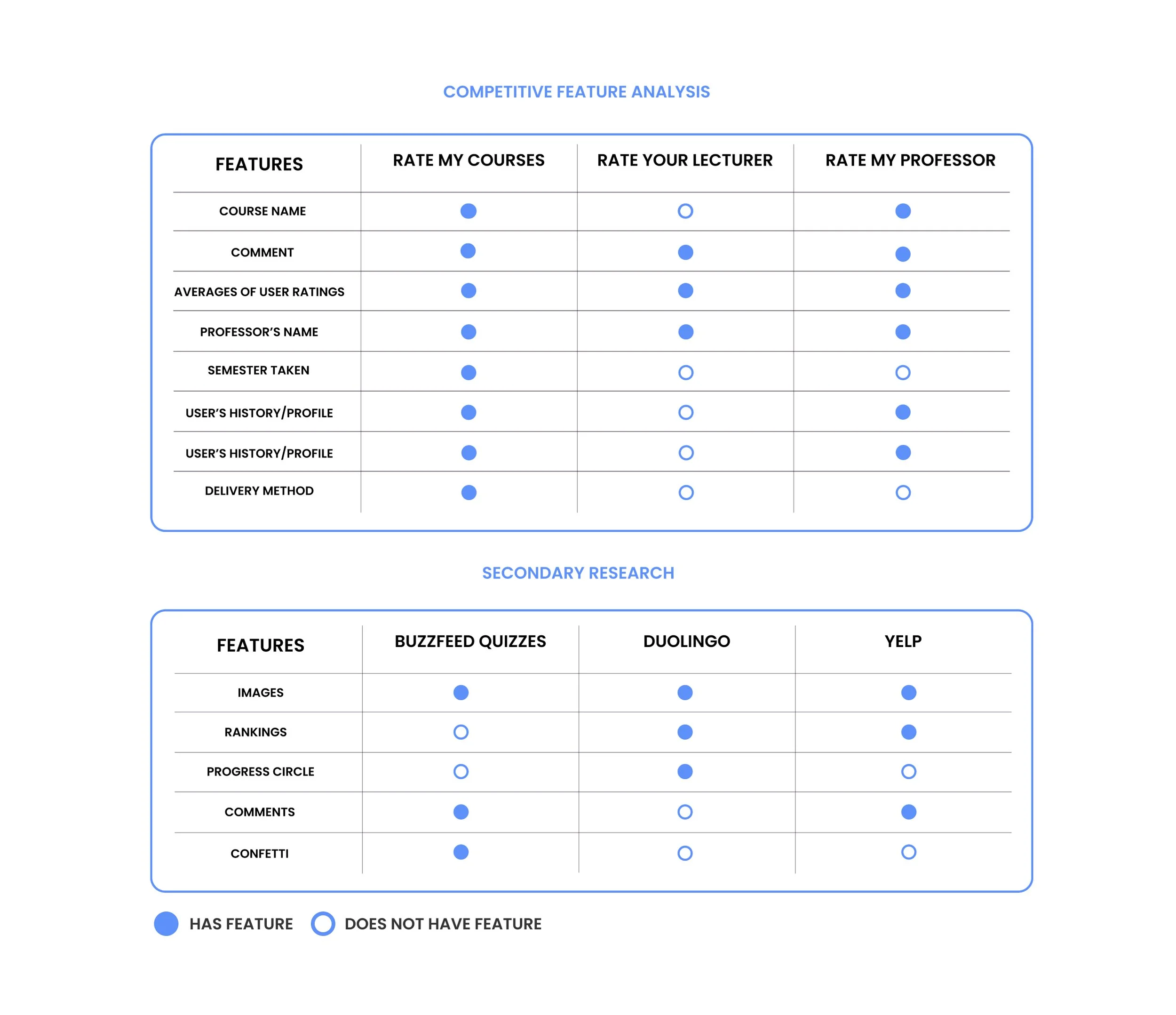
2. Competitive Feature Analysis
I mapped ClassRanked against direct competitors and studied how apps outside the space like Duolingo, Buzzfeed, and Yelp get users to willingly contribute feedback. The goal was to understand what features drive voluntary participation, not just compliance.
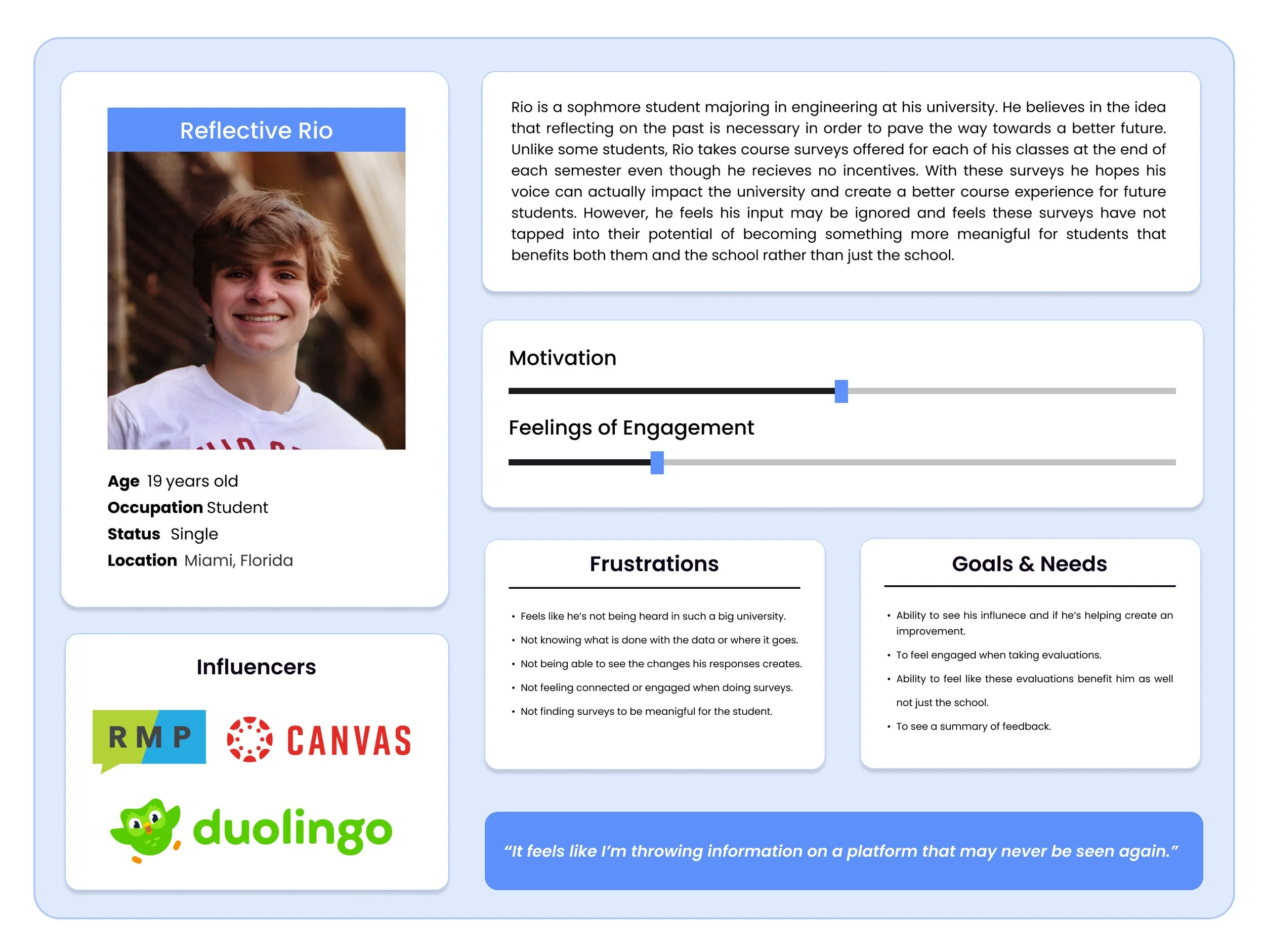
3. User Persona
Interview data pointed to one consistent archetype. I synthesized it into a persona to keep design decisions grounded in a real user, not assumptions.
Reflective Rio:
An engineering major at a university.
Feels disengaged and unheard.
Wants benefits, to feel engaged, and the ability to see his responses cause change.
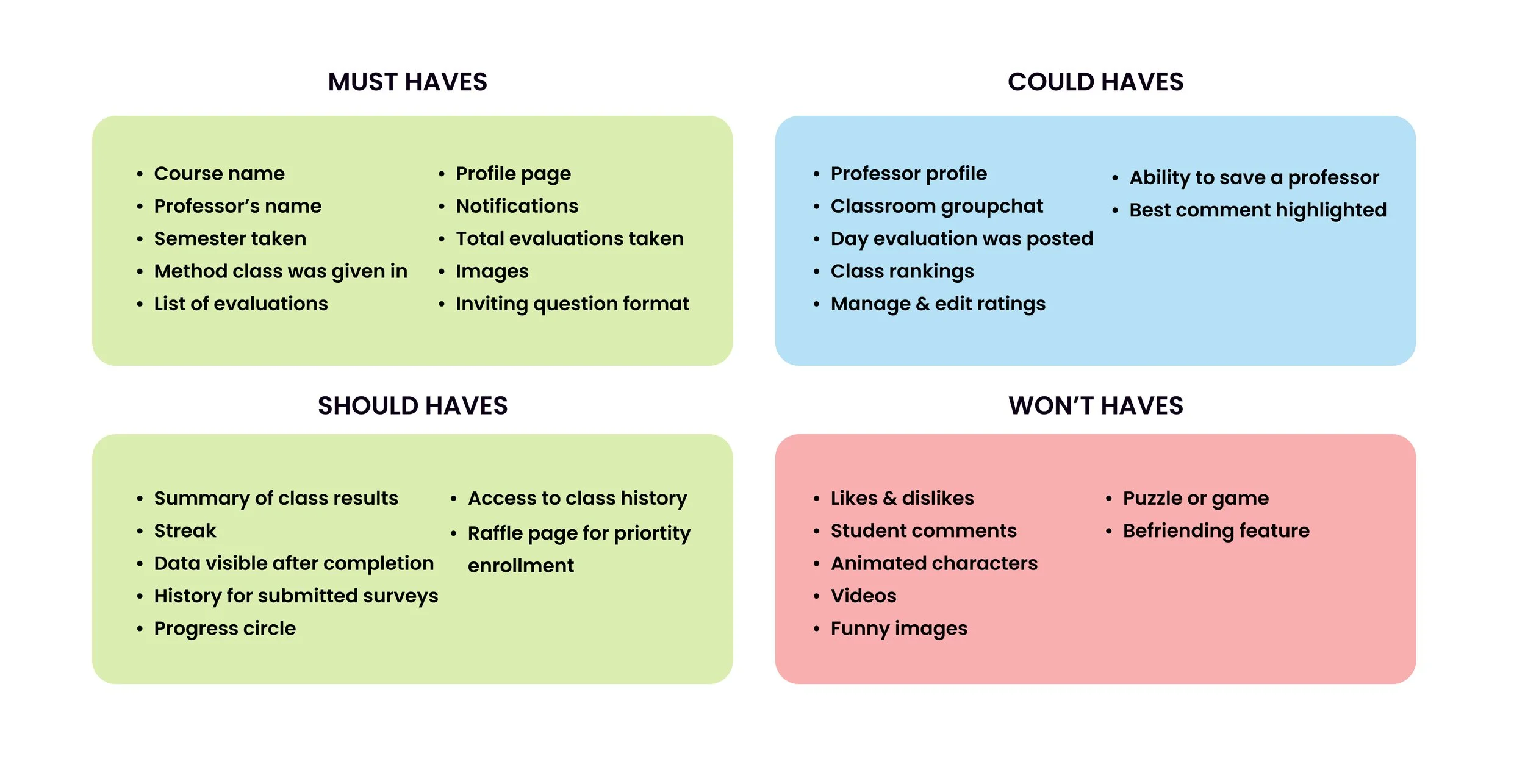
4. Ideation/MVP
With user pain points clear, I used the MoSCoW method to prioritize features and define the MVP, the minimum needed to make the app valuable without overbuilding.
Early testing with students helped validate one key decision: the non-monetary incentive would be priority enrollment, something students actually wanted.
HMW: How might we make course evaluations more engaging, meaningful, and so that students feel heard?
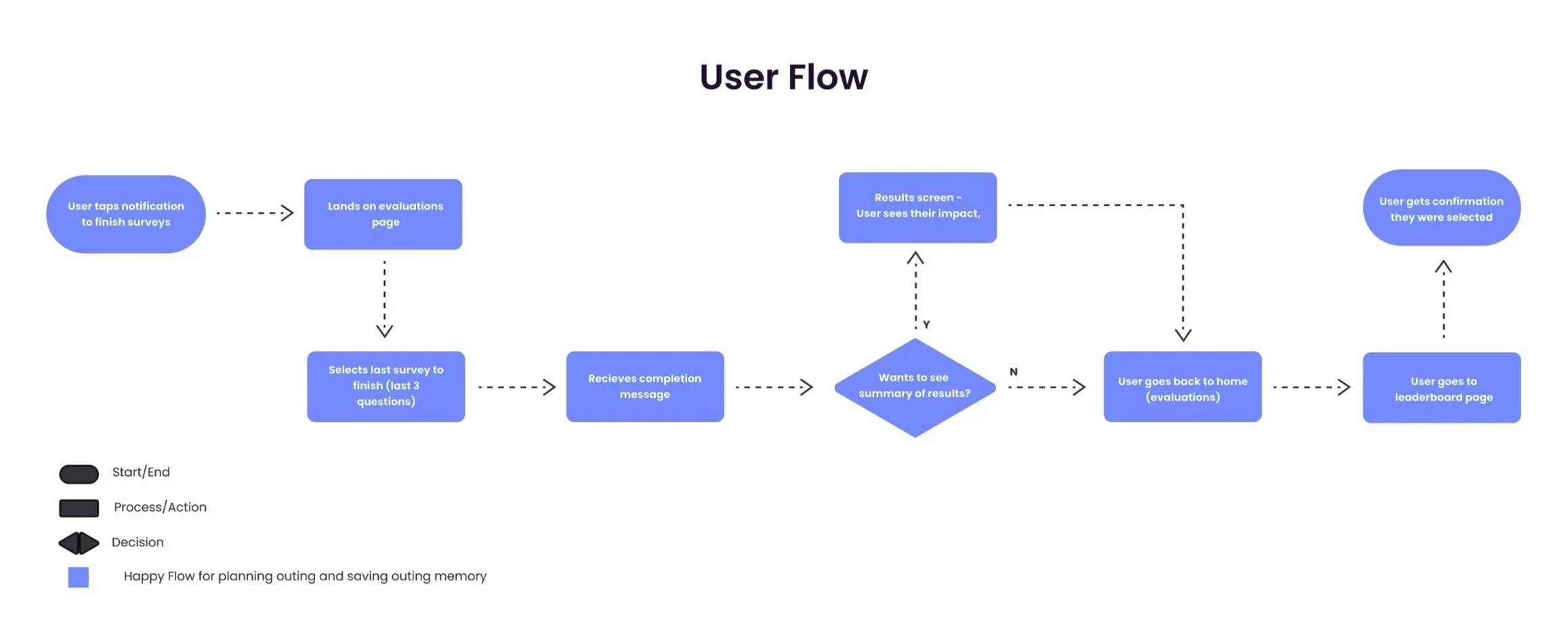
5. User Flow
I mapped the happy path around one core scenario: a student opens the app, completes their course evaluations, and gets entered into the priority enrollment raffle.
The flow helped scope the screens needed and ensured every step had a clear purpose.
6. Wireframes
With the user flow serving as a guide, I used the Crazy 8’s method in order to sketch out designs before arriving to the lo-fi wireframes shown below. Wireframes were tested with 5 users and feedback was implemented into each redesign.
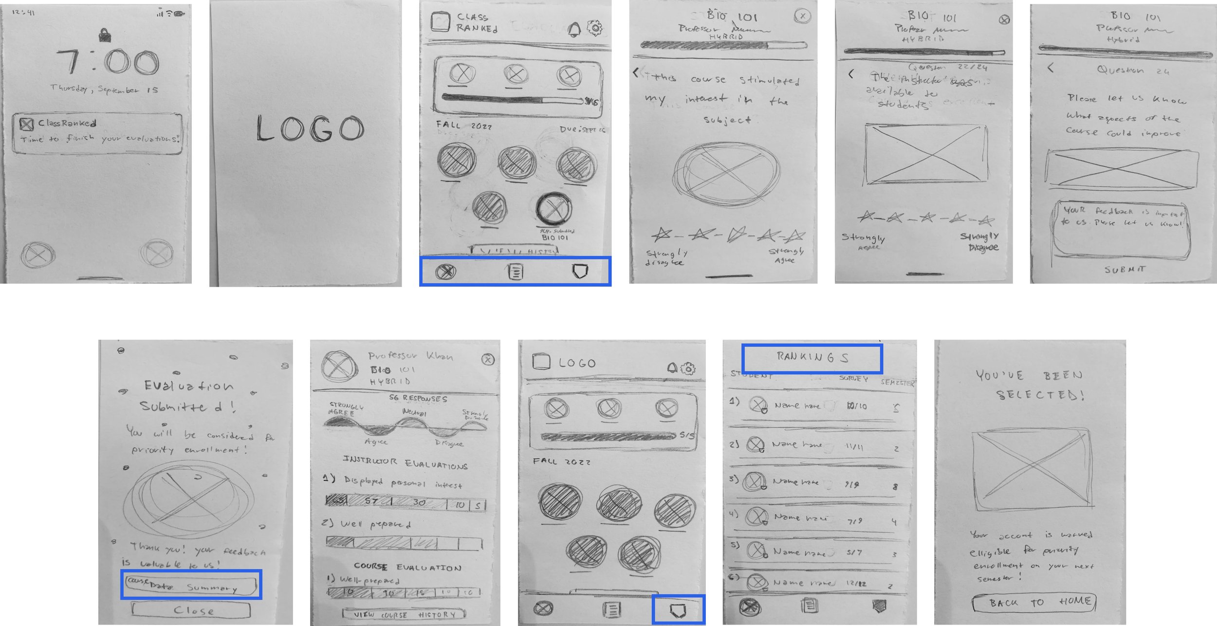
Lo-Fis User Feedback: Testing surfaced four clear fixes: navigation icons needed labels, the "course data summary" button terminology was confusing users, the leaderboard badge icon wasn't recognizable, and "Rankings" as a page title didn't match language users were familiar with. All four were addressed before moving to mid-fis.
Mid-Fis User Feedback: Two interaction decisions got challenged in testing. Users expected "strongly disagree" to appear before "strongly agree" (the order they'd seen everywhere else). Users also wanted manual control over moving to the next question rather than having it auto-advance, so I added explicit navigation. Both changes came directly from watching people use it, not assumption.
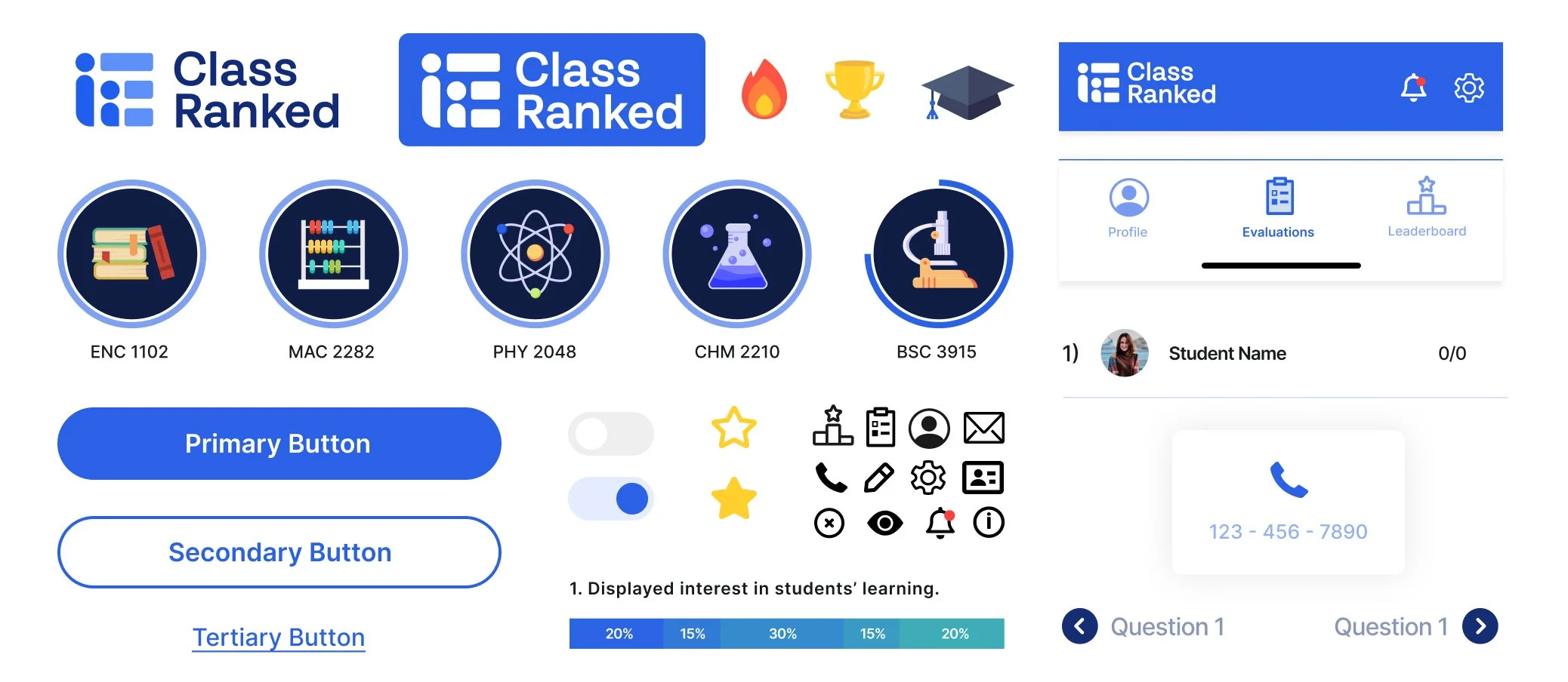
7. Branding Guide
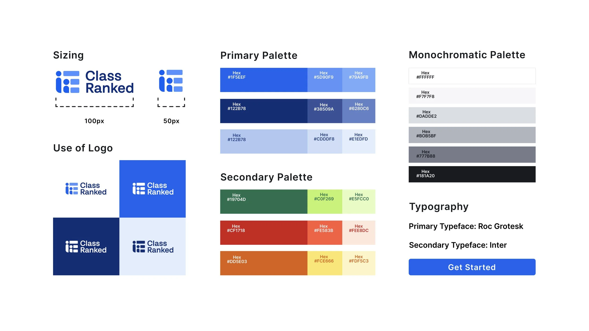
Before moving to hi-fis, I reviewed ClassRanked's branding guidelines to make sure the design stayed on brand. I was given some room to explore, so I pushed the visual direction where it made sense while staying within their system.
8. Design System
To keep components consistent across the app, I built a design system on top of the branding guide covering buttons, icons, typography, and UI patterns.
This gave the hi-fis a solid, repeatable foundation and would make handoff to engineers straightforward.
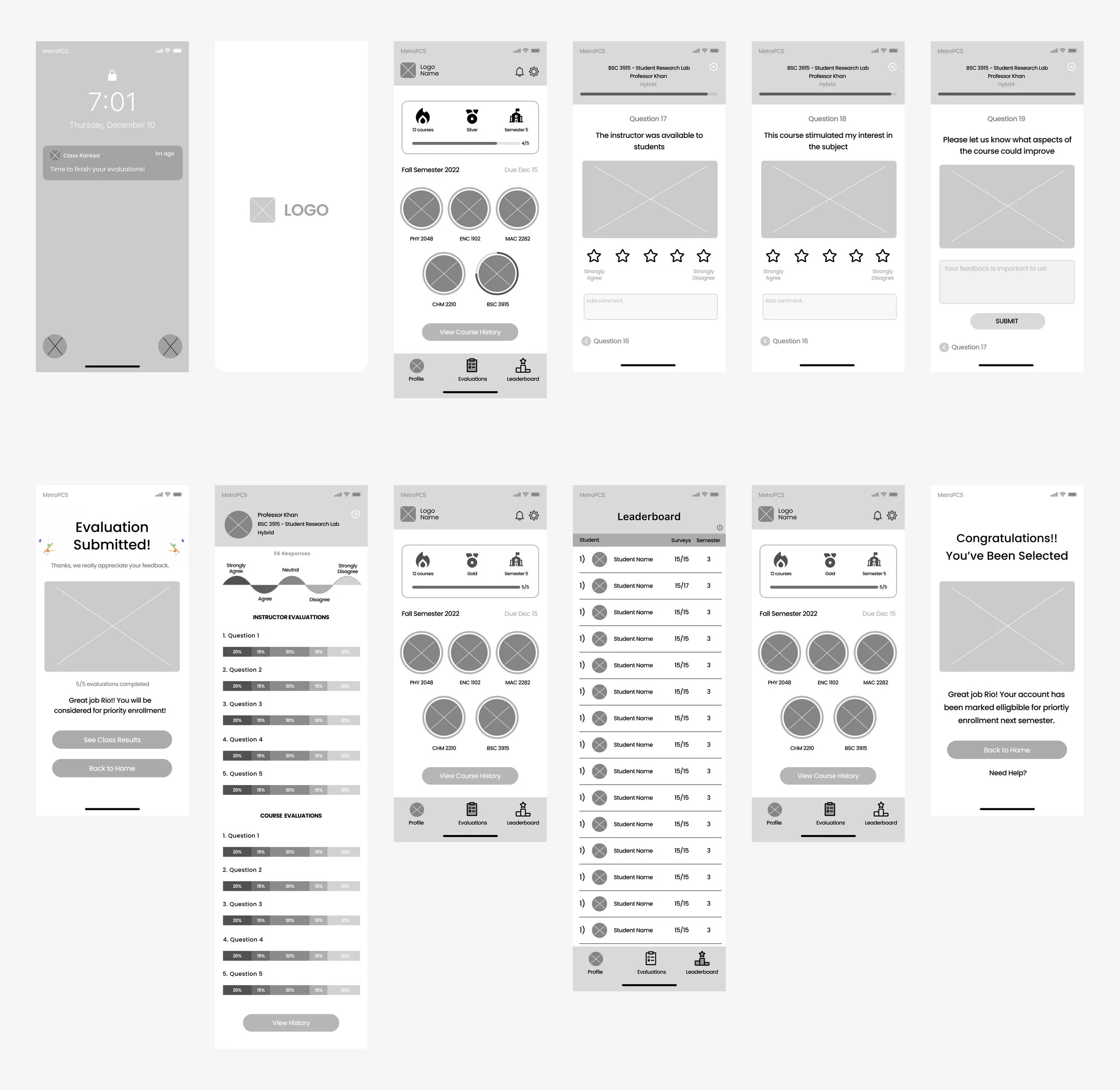
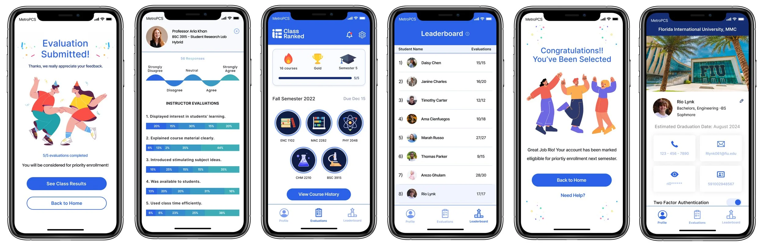
9. Hi -Fis
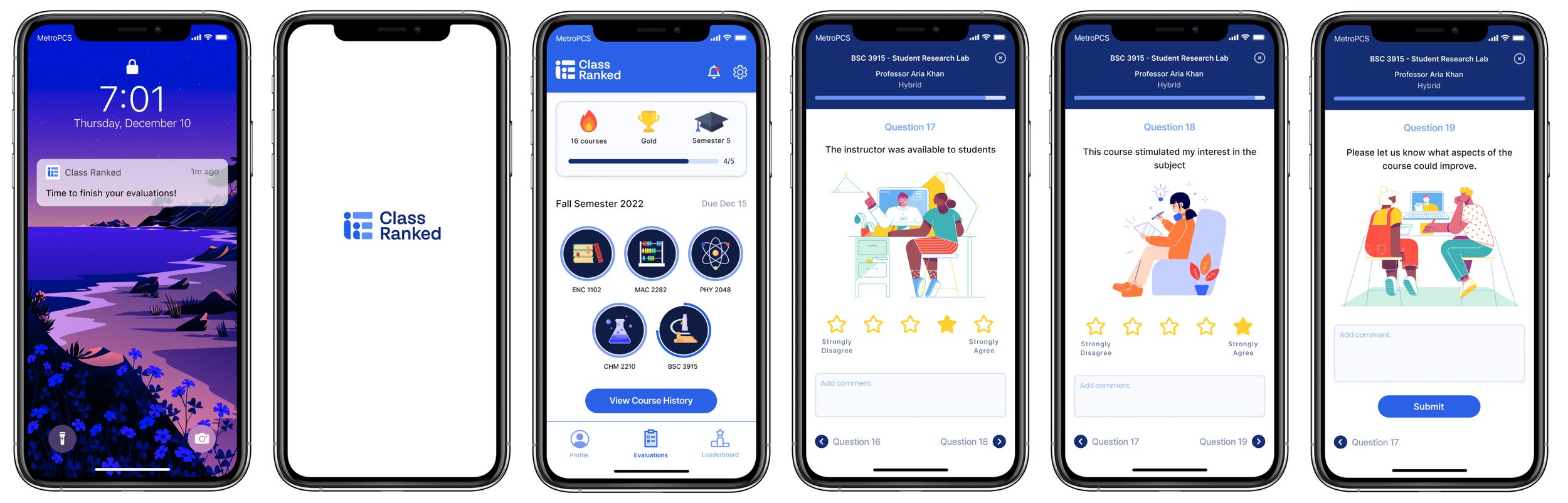
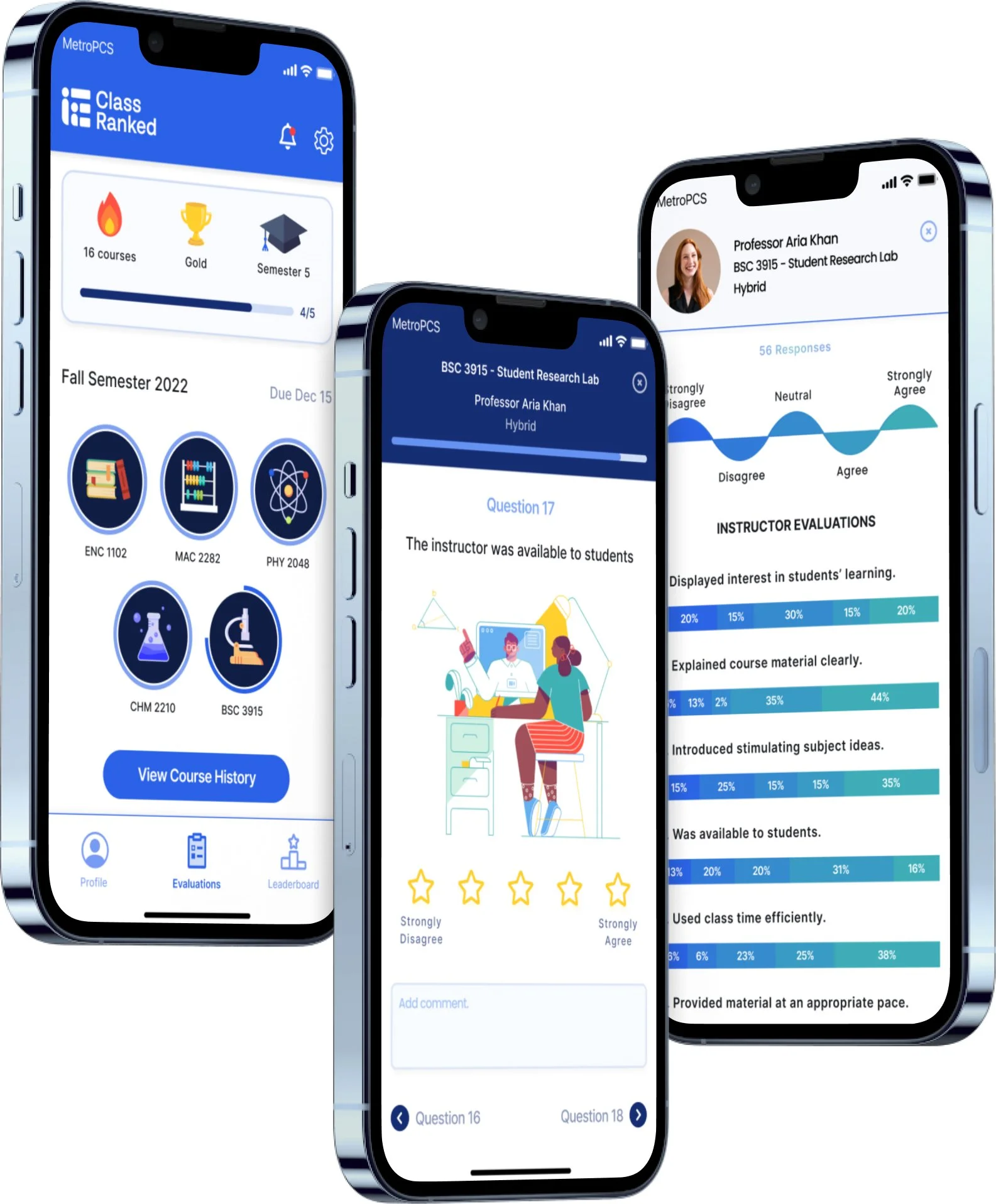
Following the branding guide and feedback from testing, I was able to create my Hi-fi’s! Below I’ve listed the steps of how it works.
Fun Fact: I created the colored icons used on the home screen using Figma and Illustrator!
Happy Path Steps: Tap on the notification, select BSC 3915 (a biology lab course), Tap on a star and add a comment to answer question 17 and proceed to the next question, repeat for question 18, add a comment and tap “Submit” on question 19, see congratulations screen (after all evaluations are completed a student is eligible for the priority enrollment raffle, select “See class results” to compare how you felt with the class average, select the “x” on the top right, select the leaderboard tab ( access granted after all evaluations completed), see where you stand in how fast you completed all evaluations (everyone on this list is eligible for the raffle), navigate back to home (evaluations screen), receive congratulatory message, navigate to profile page.
Figma Prototype
Below is the prototype I created! Feel free to check it out or click “Test Me!” to open it on another page!